Thursday, 18 March 2010

1.) In what ways does your media product use, develop or challenge forms and conventions of real media products?


My media product uses forms and conventions of other real media products in many ways.  I wanted to make my music video fit into the conventions of genre of a solo acoustic music video.  I have chosen to have both narrative and performance in my video, which is very common among music videos, especially in my chosen genre.  

The narrative is supposed to complement the lyrics by almost mickey mousing them.  I did not want my narrative to go along with every line in the song because I think that this would be cheesy and it would not flow so well.  

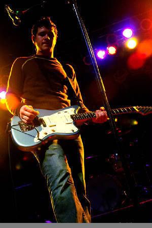
The performance needs to go with the music perfectly otherwise it would look ridiculous and out of place.  I chose to have my performance on a bench for most of the song as this is quite a common thing to find in acoustic music videos.


The various real media productions I have researched were these:

Bright Eyes - First Day of My Life. (acoustic)

City and Colour - Waiting. (acoustic)

Brand New - Sic Transit Gloria... Glory Fades. (Alternative Punk)

The Cure - Close to Me. (New Wave - Post Punk)

Coldplay - The Scientist. (Pop Rock)

Radiohead - Street Spirit (fade out). (Alternative Indie Rock)

Funeral For a Friend - Juneau Acoustic  (Alternative acoustic PostHardcore)


All of these videos I researched are within the Alternative genre as this is the sort of genre I wanted to emulate.  I wanted to take different aspects from each video to include in my music video.  I wanted to include the almost depressive vibe from ‘Waiting’ as this fits with the mood of the song. From ‘Sic Transit Gloria... Glory Fades’ I wanted to take the mystery factor as this makes people think about the video and then maybe watch it again.  I really liked the idea of traveling and movement in ‘The Scientist’ and again it used mystery as you do not know where he is going or coming from as it is reversed.  

I decided to replicate the conventions of these music videos in the way I used lip syncing.  Music videos generally have the vocalist singing along to the song, which is known as lip syncing.  I did this by having the song playing in the background when I filmed and sang along.  Then during the editing stage I had to match the sound in the film to the recorded version of the track.

2.) How effective is the combination of your main product and ancillary texts?


My main product is a music video for a singer songwriter.  My two ancillary texts are the DVD/CD Digipak and the Magazine advert.  The DVD/CD Digipak is for a young solo artist called Charles Dean. The product is his latest EP which contains a bonus DVD.  The magazine advert is promoting the EP, it does this by using the same artwork as the Digipak. It also gives information about where the EP is available.

I decided to make the Digipak because it makes the whole project feel a lot more realistic and it gives the Music Video a physical package.  I chose to do the Magazine advert as I have experience in magazine production seeing as for my AS coursework I made the front page, a contents page, and a double page interview spread for a music magazine.  I read a lot of music magazines and see adverts for new music all the time, whereas I rarely visit band’s websites.


I looked at Digipaks for:

Brand New - The Devil and God are Raging Inside Me


Photobucket


Hope of The States - The Lost Riots


Photobucket


The Arcade Fire - Funeral


Photobucket


These three Digipaks all follow the same sort of style.  They’re all folded card with two different sections for a CD and an inlay.  The cover for ‘The Devil and God are Raging Inside Me’ is a really striking image which I really liked the idea of replicating.  The inside of ‘The Devil and God Are Raging Inside Me’ is also quite striking which is a look I was going for.

I looked at magazines to find adverts for new CDs by bands. I looked at the Foo Fighters advert for Echos, Scilence, Patience and Grace which used artwork from the album art and used the same fonts as that on the album cover. 

When it came to my ancillary tasks I wanted to form an image.  With the Digipak I wanted to create a visual version of the CD. I wanted to carry on the theme that I had created with the Digipak. This would give the product and it’s ancillary tasks a sense of convergence, which would help sell the product.

3.) What have you learnt from your audience feedback?


The target audience that I used for my audience feedback was 17-18 year olds. This age group are the people are physically approached to gather my audience feedback.  I chose this age group because they are the same sort of age as me and I chose to make the video for the enjoyment of people my age from the “Indie” social group.  I also uploaded my video to YouTube so that anyone could access it if they wanted to. The use of YouTube is a good way to gather audience feedback as you will get the opinions of people who want to watch it, they are also more likely to be honest as they do not know you or care about your feelings as much as your friend.


I gathered a few people round to watch my music video on my laptop.  I gave them a small list of questions to answer about my video.


- Does the video fit into the Indie/Acoustic genre?

- Does the video complement the music?

- Is there a good balance between performance and story?

- Is the character dressed appropriately for the music/video?

- Any other comments?


The general consensus was that my video was appropriate to the genre and kept the audience interested.  Everyone thought that my video worked very well with the music and was very professional.  The audience said that the video could probably have a bit more variation in story line.


I uploaded my music video to Youtube to get more audience feedback from members of the public.  Youtube also has it's own 5 star rating system and an opportunity for people to comment on videos.

Here is a screen grab from Youtube.


Photobucket


I have had almost 40 views since I uploaded the video, two 5 Star ratings and two comments on my video, both of which are positive.  This shows that my video has been a success with members of the Youtube community and that it follows the conventions of a regular music video.


After creating my Digipak and Magazine Advert for my product, I showed these to the same people who saw my video.  I did not create questions for these ancillary tasks, I just asked for comments.  My ancillary products were greeted with such comments as “This looks very professional”,  “I could imagine this being in NME”.  Overall my main product and it’s ancillary tasks have been a success.

4.) How did you use new media technologies in the construction and research, planning and evaluation stages?


Here is a list of Software that I used during all the stages of creating my media product and the tools I used within these programs.


Safari Web Browser

www.google.co.uk/imghp

www.last.fm

www.myspace.com/music

Cubase 4

Record function and various inserts which were used in the mixing stage of the recording process of the song.

iMovie 08

Imported video files.

Chopped video clips.

Arranged clips.

Added music to video.

Edited the lighting and effects on the video.

Photoshop Elements

Imported pictures.

Used the filter tool to change the colour of my digipak background.

Used the polygon selection tool to cut out letters from another image to import into my digipak front cover.

Magnetic selection tool to import the peacock into the digipak front cover.

Invert tool to get the right colour for the peacock.

Brightness/Contrast on the back of my digipak image.

Text Input.


In my A2 Media Production I created a music video.  This has taught me many new skills which I feel have developed over the time in which I made my video.  The fact that I made a Music Magazine for my AS Media Production meant that I had to learn completely new skills in my A2 Production.  I had only used iMovie when creating a preliminary task at AS, and this was using a different version of iMovie.  My skills quickly developed when undertaking my A2 task, I am now very experienced in cutting footage and editing lighting in iMovie 08, whereas before, I only had limited expertise in cutting footage in iMovie HD.  My photoshop skills have developed a lot as well since my AS Production.  The skills I used in photoshop at AS were very basic and limited, I only really used the tools for editing brightness and contrast whereas in my A2 production I used various different tools to a much higher standard.  This is because my AS production did not need to use as many tools and skills as my A2 production to keep within the conventions of an indie music magazine.  


My photo and video editing skills are the skills that have improved the most during my A2 Production.  Before I started making my video, I had extremely limited knowledge and expertise with iMovie.  The same applies to my photoshop skills,  I had never used photoshop before I constructed my digipak and magazine advert.  I can now use all the tools confidently and produce edited pictures to a high standard.  

I wish that I had chosen a different song which involved a full band set up.  I would have liked to have worked with other people so that different peoples ideas and creativity mixed together to create a better result.  I would have liked to have had a more striking image for the front cover of my digipak because this is how my influences are.  I would have liked to have used the same camera that I used in my AS Production for my A2 Production because I would have had more control over the image quality.  The picture I used was good, but was highly edited rather than being a quality picture in its raw form.  I wish I had access to FInal Cut as it has a lot more features than iMovie and is therefore able to create videos to a higher standard.

Wednesday, 17 March 2010

Magazine Advert Final Cut

Here is the final cut of my magazine advert.

Photobucket

I am very pleased with the result of this product as I feel it follows the conventions of magazine adverts for music.  It in keeps with the style of the digipak.

Digipak Final Cut

Here is the net of my final cut for my Digipak.

Photobucket

This is then imported into a program called 2D Design.  It is then printed out onto A3 paper.  I stuck this image onto a piece of card and cut it out into the appropriate shape and folded it into the shape of the digipak.

Photobucket

Above is the final cut of the Digipak folded into the right shape.  The CD slots in between the back cover and the inside image, and the bonus DVD slips into the same section but on the opposite side at the front.

Music Video Play

I uploaded the final cut of my music video to www.youtube.com
I have done this so anyone in the world can watch it, rate it and comment. Youtube is also a great way to gain publicity for musicians so this is a bonus for me as I am the musician and actor in this video.
Here is the link to my video
http://www.youtube.com/watch?v=AGss7Qsaz1o

Here is a screen shot of my video on Youtube.

Photobucket

Magazine Advert Construction

I decided to follow this convention as adverts generally show the main artwork of the digipak, but I did not want the poster just to be a picture of the digipak, so I followed the same idea that the Foo Fighters had used.

I started my magazine advert by taking the main image from the front cover of my digipak and making it big enough to fill a4. This meant that only the side where the blue light pole is was in the picture. I did this to keep continuity between the products.

Photobucket

I then copied the name of the artist and the name of the EP over to magazine advert. I placed the name of the artist at the top of the poster and the EP name in the middle. This makes it easy for people to see who and what it is, it also follows the Foo Fighters example. In the top left of the advert I have a small picture of the peacock to keep in with the digipak. Along the bottom of the advert I have "NEW EP OUT 9.02.10" in the same font as the artist name. Below this I imported the logos of three popular music outlets. These are AMAZON, SPOTIFY, and iTunes. I chose these two (Amazon and iTunes) online music outlets because people in my target audience are more likely to download music than go out and buy the CD. Spotify is a program which you download from the internet and is used for streaming, I chose to put Spotify on my advert as it is a new way of listening to music and it shows that my artist is up to date.

Photobucket

I did not really use many skills on this task as I did not need to do much editing. All I really needed to do was import images from other projects and logos from the internet.

Magazine Advert Research

I researched magazine adverts for new albums.
I used magazines such as Q, NME and Mojo to research. I chose these three magazines as they advertise CDs for the indie and rock genres. I looked through these magazines and found an advert for the Foo Fighters album "Echoes Silence Patience & Grace"

Here is the album cover

Photobucket

The advert uses the same main image as the album cover and gives details of release and where to buy it. It also uses the same fonts in the advert as it does on the CD cover.


Digipak Construction

Front of Digipak

I started my digipak by taking a photo at the Marina in Portishead.

Photobucket

I then imported this into photoshop to start the editing process. I cropped it down to the size and shape of a CD cover. I used the filters tool to change the colour of the picture, to a more orangey tone. This also changed how the bright light looked.

Photobucket

I then cut out letters from these three pictures.

Photobucket

Photobucket

Photobucket

I then arranged the letters to spell out the words "General, Standard, Life." as this is the name of my EP which the DVD comes with.

I also added a picture of a peacock which is on the front of my guitar.

Photobucket

I have added this picture onto every image on my digipak as a sort of Logo to keep continuity within my product.

Here is the finished front cover of my Digipak

Photobucket

Inside Cover

The inside cover is an edited version of this picture.

Photobucket

I have used the blur tool and used the function "motion blur" to blur the image, I then used the blue filter to change the colour. Over the top of this image, I wrote a thankyous list and details about the EP. In the bottom right hand corner there is a small picture of the peacock.

Photobucket

On the opposite page I have used a picture of me playing guitar at a gig.
Here is the original.

Photobucket

The original picture was taken in sepia as you can see above. I then used a filter on photoshop to make the picture more blue. I cropped the picture to fit the CD case size. I also rotated the picture to make it a bit more interesting.

Here is the final outcome of the picture.

Photobucket

The back cover of my digipak was also a picture taken at the Marina in Portishead. I took the picture at night so I could see the lights across the waters edge. Here is the original picture.

Photobucket

I imported this into photoshop and just used the Brightness/Contrast tools to edit the picture.
I also imported the picture of the Peacock and put it in the bottom right hand corner.
This is the result.

Photobucket

I typed the track listings over this image to give it the effect of being a CD digipak back cover.

Photobucket

Digipak Layout

I will follow this 4 panel digipak template.

Photobucket

For my Digipak I plan on having a striking image which catches the eye on the front (bottom right). The image on the front of a digipak says a lot about the music inside before the listener has heard it. I will take the picture for the front of my CD case myself so I can get it how I want it.

Inside the cover (top right) I will have a fairly strange image as a background with thank yous and details about the CD. Opposite this (top left) I will have a picture of the performer as this is conventional to CD digipaks within my genre.

On the back of my digipak (bottom left) I will have a darker picture with the tracklistings on. Most CDs have their track listings on the back of their digpaks so people know which songs they are buying.

My CD will slip in behind the image of the performer (top left).

DVD/CD Digipak Planning

There are different digipak formats and templates that I can use for my DVD/CD.

4 Panel Digipak
Photobucket

6 Panel Digipak
Photobucket

Photobucket

Photobucket

I looked at digpaks for CDs of my chosen genre so I can follow the same conventions. My main influence for music is Brand New, so I naturally looked at their CD digipaks. The digipak I used as my main inspiration is the album "The Devil and God Are Raging Inside Me".

Photobucket

This digipak follows the 4 Panel digipak template. I will also use the 4 Panel Template as I want to replicate this digipak as much as I can. I also want to use an image just as striking as "The Devil and God..." because I feel this gives the album a sense of mystery in a way.

Tuesday, 16 March 2010

Final Cut

Here is the final cut of my Music Video.
It largely follows the storyboard that I had produced.

Story Board

I put together a story board for my production so I knew exactly what shots I would film. This saved a lot of time decided on shots out in the cold!


Photobucket

Photobucket

Photobucket

Photobucket

Video Storyline

My music video shows a young man who has just experienced a loss and is going through various emotions as he tries to find a place of solitude both physically and mentally.
The video starts with the character sat on a bench playing his guitar. He then notices an arrow on the floor, he decides to walk in the direction of the arrow to see what it is leading to. After this arrow he comes to another and follows that, he repeats this throughout the video and it is interrupted by shots of performance. At the end of the video he finds himself back in the same place as he started. These arrows represent the way he is trying to find direction in his life and where he should go after his loss. The fact that they lead him back to where he started shows that he has found the solution and direction which is within himself. The character then walks off with his guitar in hand away from the camera.

Target Audience

My Target Audience are people who like acoustic and emotional music, generally not in the mainstream. These people can be either Male or Female and there is a loose age bracket of 15-30 year olds.

As I fit into to this target audience, I have a good understanding of what people want to see and hear in a video for a song. The song is a mixture of the alternative, acoustic and indie genres which are three of the genres of music that I listen to a lot. Two artists who fit into this hybrid genre are City and Colour (Dallas Green) and Frank Turner. I have often been told that the music I write sounds like Frank Turner's music.

My target audience want to see performance from the artist. There is usually a fair amount of imagery used in my chosen genre, so my target audience would want to see that too. They also generally like to see a character that is very easy to relate to, someone who maybe dresses like they do, or acts like they do, or goes through the same feelings.

Photobucket

As a fan of Brand New and their lead singer Jesse Lacey, I feel I can relate to him through the issues he challenges in his music/lyrics and the way he looks.

jesse lacey Pictures, Images and Photos